
Back
NxtWave • 2023 2024

Role:
Product Designer
Timeline:
Jan - Feb, 2024
Team:
1 Product Designer, 1 Product Manager
Problem Statement
Target Users
University students, early-career developers and career switchers ( India )
Preparing for technical interviews (startup roles)
Moderate coding knowledge, low tolerance for friction
Research plan & findings
We conducted inperson interviews with 12 students and 3 instructors to uncover common challenges faced while using video lesson platforms. Our goal was to understand the key pain points and preferences that impact the user experience of online learning environments.
Name
Background
Goals
Frustrations
Needs
Aravind , 21
Computer Science Undergrad
To efficiently learn coding skills, complete assignments on time, and minimize distractions.
Finds the current video platform cluttered, which makes it hard to locate important features like notes or discussion forums. Struggles with a lack of visual cues to guide her through lessons.
A clean, intuitive interface that highlights key actions, minimizes unnecessary clicks, and provides easy access to essential tools.
Name
Background
Goals
Frustrations
Needs
Harish , 26
Working as a store assistant
To balance learning with a full-time job, keep track of progress, and quickly access learning materials during breaks.
Finds the current video platform cluttered, which makes it hard to locate important features like no overwhelmed by too many options on the screen. Difficulties with locating the next steps or understanding the navigation flow. Often clicks the wrong button due to poor visibility and contrast.tes or discussion forums. Struggles with a lack of visual cues to guide her through lessons.
A clear call to action, prominent progress indicators, and fewer distractions to make the most of limited study time.
Name
Background
Goals
Frustrations
Needs
Shreya , 45
Experienced Educator
To have a seamless coding learning experience and receive actionable feedback.
Students frequently miss important sections or don't complete tasks due to a lack of clear guidance. Difficulty receiving timely feedback on the effectiveness of content.
A platform that provides analytics on student engagement, clear action prompts for students, and a streamlined way to gather feedback.
Competitive insights
️It's important to note that user preferences may vary, and these pros and cons are based on the general characteristics of each platform. Users may have different experiences based on their specific needs and preferences.
Pros
•
Structured Learning Path: Coursera provides a well-defined learning path with a clear sequence of lessons and modules, which makes it easy for users to track their progress.
•
Integrated Tools: The platform seamlessly integrates quizzes, assignments, and discussion forums within the course content, reducing the need for context switching.
•
Accessibility Features: High contrast, adjustable text sizes, and screen reader compatibility ensure a wide range of users can access the content comfortably.
Cons
•
Overwhelming Content: The amount of content can feel overwhelming for new users, especially in more comprehensive courses with multiple modules and supplementary materials.
•
Limited Customization: Less flexibility in customizing the learning experience according to individual preferences compared to platforms like Udemy.


Pros
•
Flexible Interface: Udemy’s user interface is simple, with minimal distractions, allowing users to focus solely on the video content. It offers speed controls, captions, and bookmarking options.
•
Community Feedback: Users can leave reviews and ratings directly on the course page, which helps new learners make informed choices.
•
Diverse Content Types: Udemy provides a mix of video, text, and interactive content that caters to different learning styles.
Cons
•
Lack of Engagement Tools: There are fewer built-in engagement tools like quizzes, notes, or community discussions, which may limit interactive learning.
•
Limited Course Structure: Courses are often self-contained and may not provide a broader learning path or curriculum, unlike Coursera or LinkedIn Learning.
LinkedIn Learning
Pros
•
Professional Development Focus: Content is highly focused on skills that are relevant to professional development, such as software, business skills, and creative tools.
•
Integrated Social Learning: Users can share their learning progress, and completed courses appear on their LinkedIn profiles, adding a social and professional aspect to the learning experience.
•
Clean and Intuitive UI: The interface is minimalist, with a strong emphasis on ease of navigation and a clear presentation of learning paths.
Cons
•
Less Interactive Content: Limited interactive elements like quizzes or assignments compared to Coursera, which might impact retention and engagement.
•
Subscription-Based Model: The subscription model may deter users who prefer a one-time purchase, like on Udemy.
STUDENT PAIN POINTS
Overwhelming Interface:
Many users reported feeling overwhelmed by the number of options and the cluttered design, leading to confusion about where to click and how to proceed.
Lack of Visual Guidance:
Students expressed frustration with the absence of visual cues or a clear content hierarchy, making it difficult to identify the next step or the most critical content.
Poor Accessibility and Readability:
Users highlighted issues with low contrast between text and background, small font sizes, and inconsistent button designs, which made the platform less user-friendly, especially for those with visual impairments.
Fragmented Learning Experience:
The lack of integration between different parts of the platform (e.g., video, notes, discussions) was a common concern. Students often felt that the learning tools were scattered and disconnected.
Ineffective Feedback Mechanisms:
Both students and instructors found it challenging to provide and receive feedback effectively. There were no clear pathways to submit feedback or report issues, which hindered continuous improvement of the platform.
IDEATION
Students need a way to navigate and engage with video lesson content seamlessly, without feeling overwhelmed by a cluttered interface or disconnected tools, as this disrupts their focus, understanding, and overall learning experience.

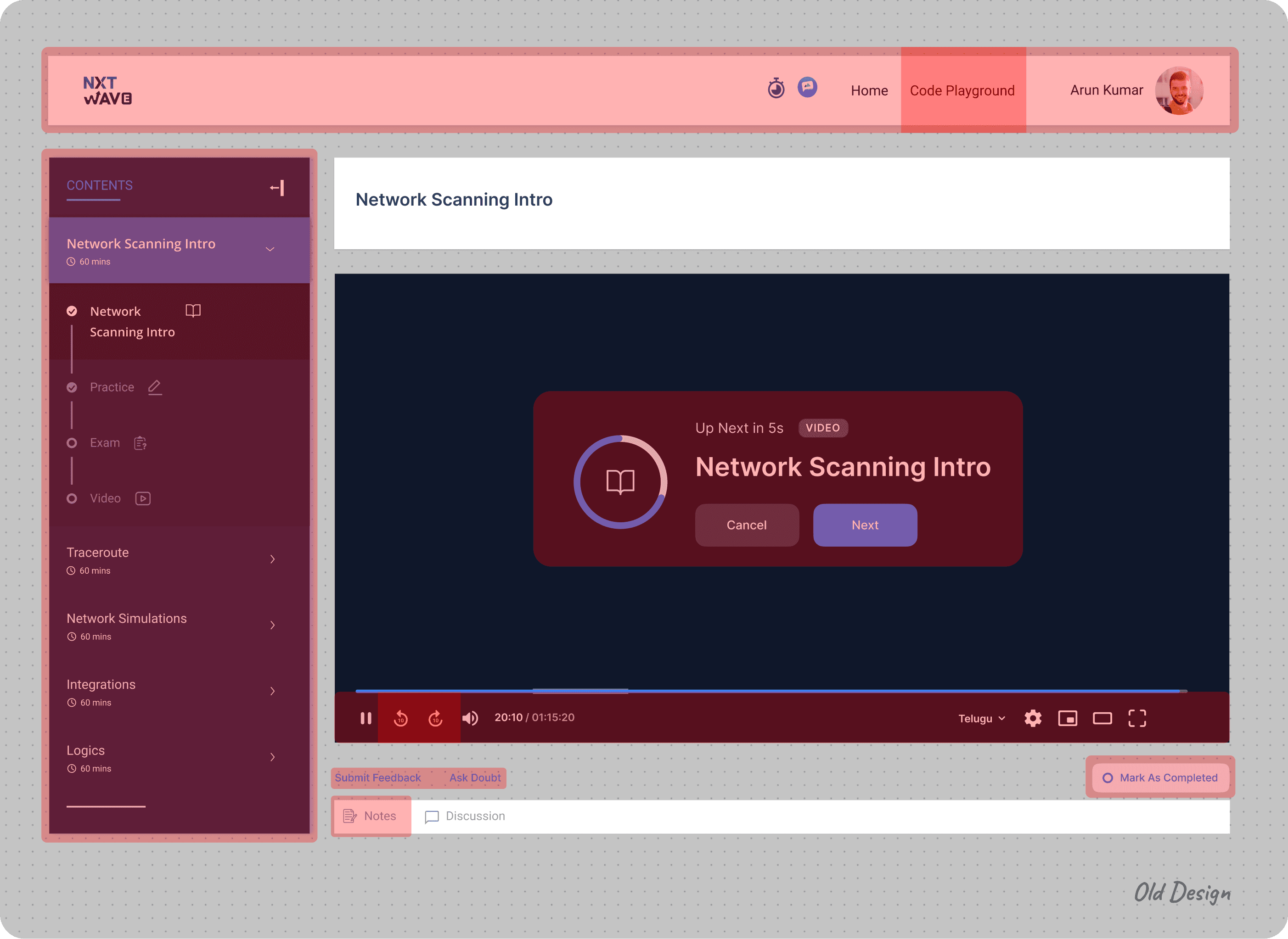
The "Mark As Completed" button is small and located in a less noticeable area.
The options like "Submit Feedback" and "Ask Doubt” are spread out at the bottom and may distract from the main content.
I've noticed that users frequently take notes during video sessions, but they often have to minimize the video to do so, which can be frustrating. To solve this, I've integrated a note-taking feature directly within the video card, allowing them to jot down notes while watching the lesson.
Users are more accustomed to using forward and backward arrow keys on the keyboard for fast-forwarding and rewinding. I have removed the icons from the video control bar.
There are three player sizes available: Mini Player, Theater Mode, and Full Screen. I simplified the options by offering only Full Screen, with the Mini Player automatically activating when users navigate to a different page.
The majority of users have expressed confusion about the left panel. After discussions with the PMs and developers, I have decided to display sessions on a daily basis. This change will help users concentrate on one specific subject at a time.
NxtWave offers two programs: Intensive and Academic. I've decided to use the specific program logo instead of a general one.
Honestly, none of the students use the top navigation bar. Therefore, I’ve decided to remove it, along with the timer and chat icon, due to their minimal usage.
Since all our lessons focus on coding, we want students to practice coding simultaneously. Currently, users overlook the code playground option due to its placement.
Since students rarely log out of their accounts, I decided to reposition the profile icon, which also serves as an indirect log-out button.
The text sizes and elements like "Network Scanning Intro," the video controls, and the "Next" button seem to blend in without a clear visual hierarchy.
The controls at the bottom (e.g., play/pause, volume, subtitles) are a bit difficult to distinguish from the dark background.
Low-fI wireframes
Students need a way to navigate and engage with video lesson content seamlessly, without feeling overwhelmed by a cluttered interface or disconnected tools, as this disrupts their focus, understanding, and overall learning experience.


HIGH-fI WIREFRAMES
I chose a clean and intuitive layout with minimal distractions to enhance focus on the video content.
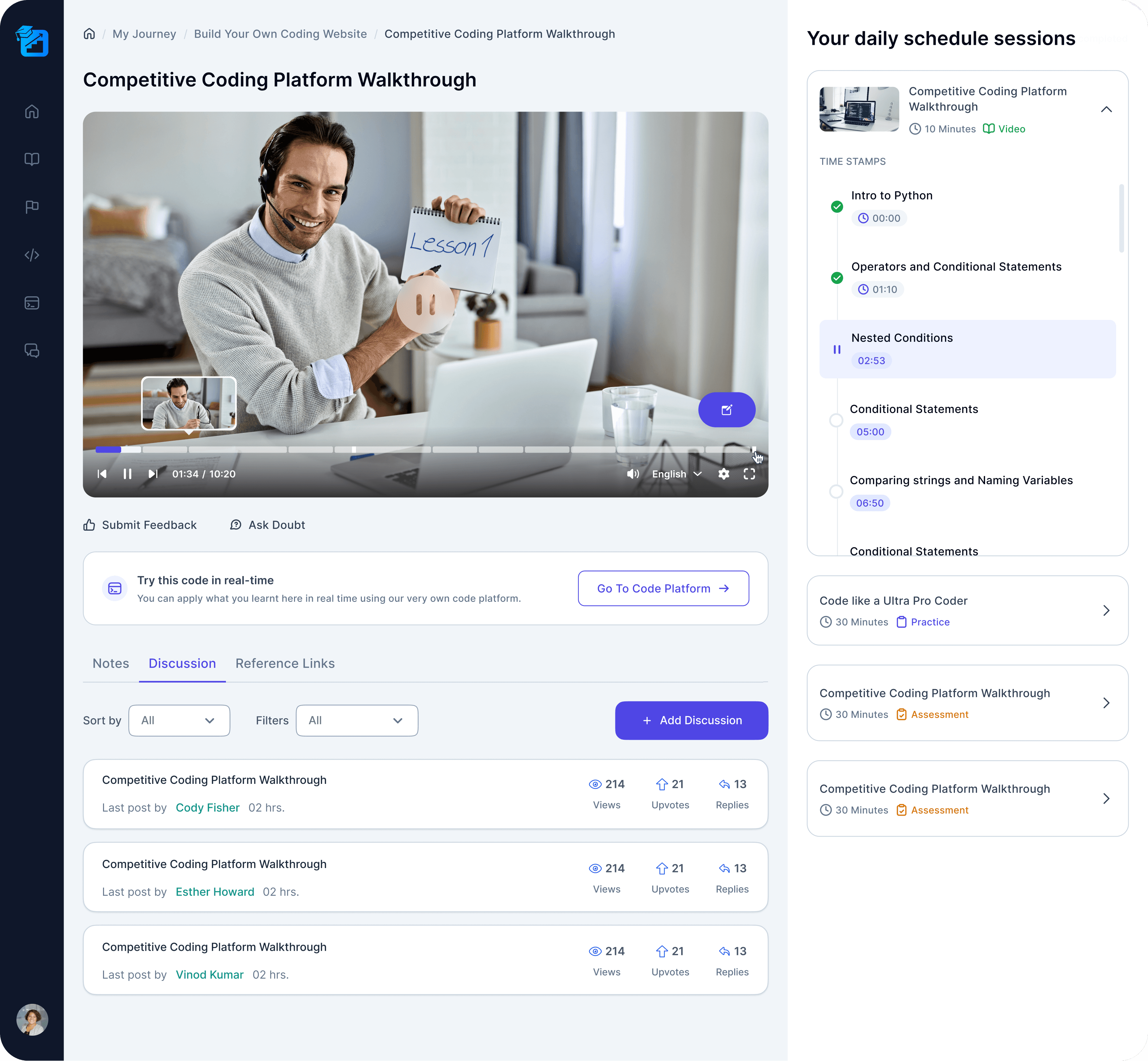
Based on user feedback and the competitive analysis of platforms like Coursera, Udemy, and LinkedIn Learning, I have made several key changes to the session page design.
Simplified Navigation
The navigation sidebar on the left has been significantly cleaned up, with more intuitive icons. This reduces visual clutter and helps users focus on the main content, minimizing cognitive load.
Minimized Distractions
Elements like "Submit Feedback" and "Ask Doubt" have been relocated to less prominent areas. They are still accessible but no longer dominate the user’s attention. This approach reduces distractions, while still allowing users to engage with these features when needed.
Improved Contrast and Readability
The redesign has improved the contrast between text and background elements, which enhances readability.
Integrated Notes Section
Students can take notes directly without leaving the video player.
Overwhelming Interface
Primary actions, such as "Go To Code Platform," have been made more prominent. The use of color and size effectively draws the user’s attention to key actions.
Organized Time Stamps
The right-hand side panel with clear, well-organized time stamps allows students to jump to specific parts of the video effortlessly. This structure supports better content retention, as users can quickly revisit sections they may have missed or need to review, promoting a more efficient learning experience.


This will allow students to take notes without minimizing or navigating away from the video, it keeps them immersed in the learning process.

Students can easily refer back to their notes while re-watching the video or revisiting specific sections. Having all the information in one place video content and notes streamlines the revision process.

Discussions
Students can engage in discussions with their peers, with the option to upvote and reply to each other's posts.

Reference links
Reference links allow students to access the original articles, videos, or books the instructor used, helping them gain a deeper understanding of the material.

Your daily schedule sessions
This feature helps users stay organized by providing an overview of their upcoming sessions or tasks. It ensures that students can manage their time effectively, keeping track of their learning activities and deadlines for the day.
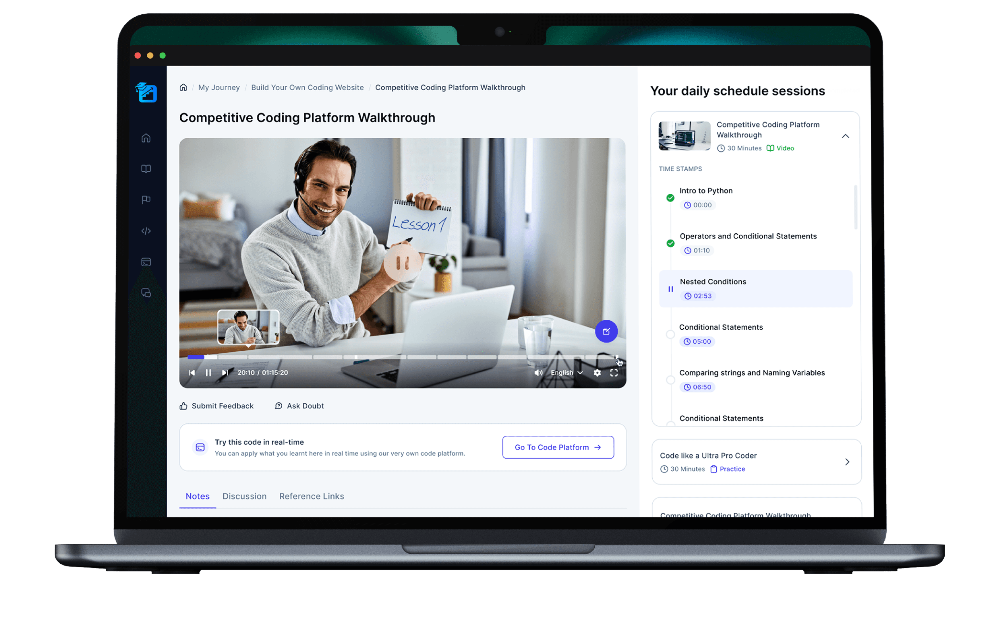
All screens
